
Responsive Web Design: Adapting Websites for All Devices
Responsive Web Design: Adapting Websites for All Devices
The digital landscape is constantly evolving. Therefore, it is no surprise that users access websites from an ever-increasing array of devices, ranging from large desktop monitors to tiny smartwatches. In this diverse ecosystem, ensuring a consistent and optimal user experience across all screen sizes is not just a luxury; it is a fundamental necessity. This is precisely where Responsive Web Design comes into play.
What is Responsive Web Design?
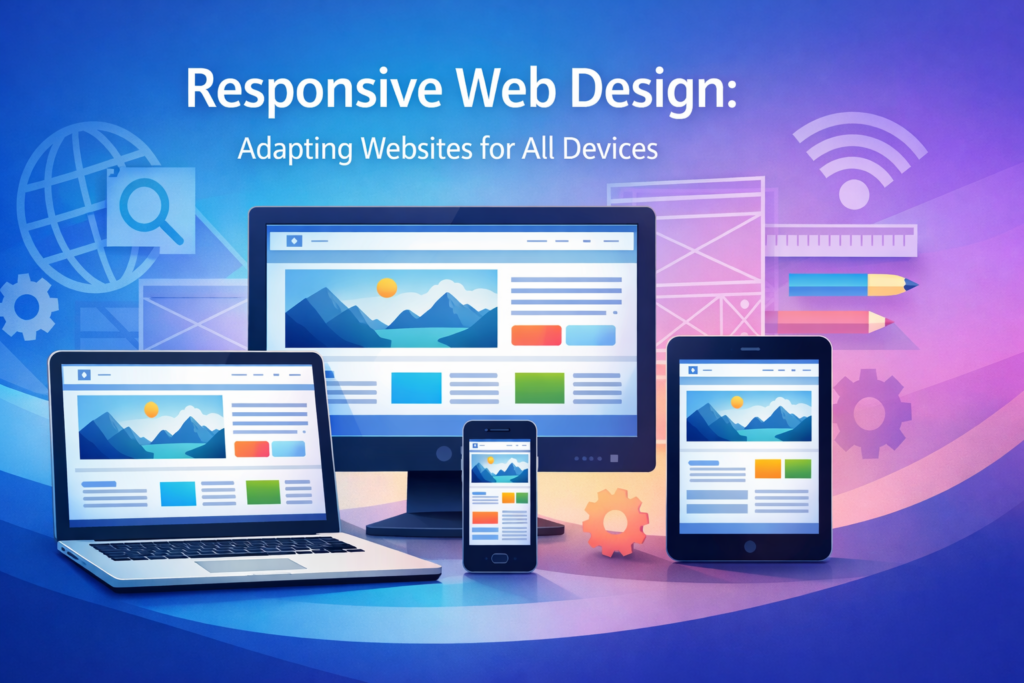
Responsive Web Design (RWD) is an approach to web development that aims to create websites providing an optimal viewing and interaction experience across a wide range of devices. This includes easy reading and navigation with a minimum of resizing, panning, and scrolling. Essentially, a responsive website intelligently adapts its layout and content to fit the screen it’s being viewed on, whether it’s a desktop, laptop, tablet, or mobile phone. This dynamic adaptation is achieved through a combination of flexible layouts, fluid images, and CSS media queries. The goal is a seamless experience, regardless of the user’s chosen device.
Why is Responsive Web Design Crucial Today?
In today’s mobile-first world, the importance of a responsive website cannot be overstated. Consider the statistics: a significant portion of global internet traffic now originates from mobile devices. Consequently, businesses and content creators must cater to this mobile audience effectively.
Enhanced User Experience
A website that is not responsive often leads to a frustrating user experience on mobile devices. Users may encounter tiny text, stretched images, and navigation menus that are difficult to tap. Such issues quickly lead to high bounce rates and a negative perception of your brand. Conversely, a responsive site offers intuitive navigation, readable content, and properly scaled images, thus ensuring users can easily access information and complete tasks. This positive experience builds trust and encourages engagement.
Improved SEO Rankings
Search engines, particularly Google, prioritize mobile-friendly websites in their search results. Google’s mobile-first indexing means that the mobile version of your website is used for indexing and ranking. Therefore, having a responsive design is a critical factor for achieving higher search engine rankings. It signals to search engines that your site provides a good experience for all users, which can significantly boost your visibility.
Cost-Effectiveness and Maintainability
Historically, companies often developed separate websites for desktop and mobile users. This approach, however, doubles development and maintenance costs. Managing two distinct codebases requires more resources and time for updates, bug fixes, and content changes. A single responsive website, on the other hand, streamlines these processes. It reduces development costs, simplifies content management, and minimizes ongoing maintenance efforts. Furthermore, it ensures brand consistency across all platforms.
Future-Proofing Your Website
The landscape of devices continues to evolve rapidly. New screen sizes and resolutions emerge regularly. Building a responsive website prepares your digital presence for future technological advancements. Instead of redesigning your site every time a new device category appears, your responsive design inherently adapts. This foresight saves resources and ensures long-term relevance.
Core Principles of Responsive Web Design
Understanding the foundational principles is key to mastering Responsive Web Design. These elements work in concert to deliver an adaptive experience.
Fluid Grids
Fluid grids are the backbone of responsive layouts. Unlike fixed-width layouts that use absolute units (like pixels), fluid grids utilize relative units (like percentages or `em`s). This means that elements on the page, such as columns and content blocks, are sized proportionally to the viewport width. As the screen size changes, the grid expands or shrinks accordingly, allowing content to reflow gracefully. For example, a three-column layout on a desktop might transform into a single-column layout on a mobile device.
Flexible Images and Media
Just as layouts need to be fluid, so do images and other media elements. Statically sized images can easily break a responsive layout, either by overflowing their containers or appearing too small. Flexible images are designed to scale within their parent elements, preventing distortion or layout issues. Techniques include setting `max-width: 100%` in CSS, using `srcset` for different resolutions, and employing responsive video embeds that adjust their dimensions.
Media Queries
Media queries are a fundamental CSS3 feature that allows web developers to apply different styles based on various device characteristics. These characteristics include screen width, height, resolution, and orientation. For instance, a media query can detect if a screen is below a certain width and then apply specific styles, such as changing font sizes, rearranging navigation, or hiding non-essential elements. This targeted styling is crucial for tailoring the user experience to specific breakpoints.
Mobile-First Approach
The mobile-first approach is a design philosophy that advocates starting the design and development process for the smallest screen (mobile) first. Subsequently, designers progressively enhance the experience for larger screens. This methodology ensures that the core content and functionality are prioritized for mobile users, who often have limited bandwidth and screen real estate. Moreover, it encourages a cleaner, more efficient codebase and often leads to better performance on all devices.
Key Techniques and Tools for Implementing Responsive Web Design
Implementing effective Responsive Web Design involves a combination of established techniques and modern tools.
HTML5 and CSS3
Modern web development relies heavily on HTML5 for semantic structure and CSS3 for advanced styling. HTML5 provides elements that improve accessibility and content organization, while CSS3 offers powerful features like media queries, flexbox, and grid, which are indispensable for creating responsive layouts. Therefore, a solid understanding of these core technologies is paramount.
Frameworks (Bootstrap, Foundation)
CSS frameworks like Bootstrap and Foundation provide pre-built responsive components and grid systems. These frameworks significantly accelerate development by offering ready-to-use styles for navigation bars, forms, buttons, and more. They handle much of the underlying responsive logic, allowing developers to focus on customization and content. While convenient, it is important to understand their underlying principles.
CSS Flexbox and Grid
CSS Flexbox (Flexible Box Layout) and CSS Grid Layout are powerful CSS modules that offer highly efficient ways to arrange, align, and distribute space among items within a container. Flexbox is ideal for one-dimensional layouts (rows or columns), while Grid is perfect for two-dimensional layouts (rows and columns simultaneously). These tools provide granular control over element placement and responsiveness, often replacing older, less flexible layout methods. Consequently, they are essential for modern responsive design.
Viewport Meta Tag
The viewport meta tag is a small but critical piece of HTML code placed in the “ section of a webpage. It instructs the browser on how to control the page’s dimensions and scaling. Specifically, `width=device-width` sets the width of the viewport to the device’s screen width in device-independent pixels, and `initial-scale=1.0` establishes a 1:1 relationship between CSS pixels and device-independent pixels. Without this tag, mobile browsers often render pages at a desktop width and then scale down, defeating the purpose of responsive design.
Testing and Debugging
Thorough testing is indispensable for ensuring a responsive website performs as expected across all devices. Developers use browser developer tools (e.g., Chrome DevTools) to simulate different screen sizes and device types. Furthermore, real device testing on actual smartphones and tablets is crucial to identify and resolve layout issues, performance bottlenecks, and touch interaction problems. Automated testing tools can also help verify responsiveness across a wider range of configurations.
Best Practices for Effective Responsive Web Design
Beyond the core principles and techniques, several best practices contribute to an outstanding responsive experience.
Prioritize Content
Always remember that content is king. A responsive design should ensure that the most important content is easily accessible and readable on all devices. This often means carefully considering what elements to show, hide, or reorder at different breakpoints. For example, complex data tables might be condensed or transformed into simpler charts on smaller screens. This content-first approach guides design decisions effectively.
Optimize Performance
Mobile users, in particular, often rely on slower network connections. Therefore, optimizing website performance is paramount for responsive sites. This includes compressing images, minifying CSS and JavaScript, leveraging browser caching, and using lazy loading for off-screen images. A fast-loading site significantly improves user satisfaction and SEO.
Touch-Friendly Navigation
On touch-enabled devices, navigation elements must be large enough and spaced appropriately for easy tapping. Small, cramped links or buttons lead to frustration. Implementing hamburger menus for mobile navigation is a common practice, as is ensuring that interactive elements have sufficient padding and margin. Hence, design for fingers, not just cursors.
Accessibility Considerations
A truly effective responsive design is also accessible. This means ensuring that users with disabilities can navigate and interact with your site, regardless of their device. Considerations include proper color contrast, keyboard navigation support, clear focus states, and ARIA attributes. Responsiveness and accessibility are complementary goals, both contributing to a better user experience for everyone.
The Future of Responsive Web Design
Responsive Web Design will continue to evolve. As new devices like foldable phones, smart wearables, and augmented reality interfaces become more prevalent, the concept of “responsiveness” will expand beyond traditional screen dimensions. We can anticipate more advanced techniques for adapting content and interfaces to diverse interaction methods and environmental contexts. Moreover, AI and machine learning might play a greater role in dynamically optimizing layouts and content delivery based on user behavior and device capabilities. The core principle of adaptability, however, will remain central.
Conclusion
Responsive Web Design is far more than a trend; it’s an indispensable methodology in modern web development. By embracing fluid grids, flexible media, and media queries, alongside a mobile-first philosophy, developers can create websites that offer an exceptional user experience across all devices. This not only enhances user satisfaction but also yields significant benefits in terms of SEO, cost-effectiveness, and future-proofing. As the digital landscape continues its rapid evolution, the principles of responsive design will remain crucial, ensuring that web content is accessible and engaging for everyone, everywhere.
Visit About Us page to contact or Through WhatsApp.
Your journey starts here — and we’re ready to help you every step of the way.
Frequently Asked Questions (FAQ)
What is the main benefit of Responsive Web Design?
The primary benefit of Responsive Web Design is providing an optimal user experience across all devices, from desktops to smartphones. This leads to increased user engagement, higher conversion rates, and improved search engine rankings, as Google favors mobile-friendly websites.
Is Responsive Web Design better than having a separate mobile website?
Generally, yes. Responsive Web Design is often preferred because it involves maintaining a single codebase, which significantly reduces development time, costs, and ongoing maintenance efforts compared to managing separate desktop and mobile sites. It also ensures consistent branding and content across all platforms.
What are “media queries” in Responsive Web Design?
Media queries are a powerful CSS3 feature that allows web developers to apply specific styles based on the characteristics of the device accessing the website, such as screen width, height, resolution, and orientation. They are crucial for adapting layouts, font sizes, and other visual elements to different screen sizes.